A Community Gardener's Side Project
Building a personal website as a graphic designer
My personal website just went live, so I came to share it right away.
First published in Superlinear Academy.
Translated from the Chinese original with AI assistance. Links to Chinese posts are in that version.
About 2,900 words, 13 images, 12 minutes to read.
I officially started building it on the evening of October 15th, and had the whole site done in two days — four pages, plus a dozen or so portfolio pages. It used up half of my tokens for the week (on the $200 Claude subscription tier). For easy comparison: I used Opus 5.5 in Claude Code with effort set to max (if anyone has settings that are better or more token-efficient, feel free to leave me a comment). Here's the site: Ashton.is
Before publishing it, I first sent the website to quite a few relatives and friends around me, and went through a round of debugging. Most of them don't build personal websites or do self-media, and the first thing they all asked was the same question: What did you build this website for?
Here's a unified reply: After seeing so many of your works, I've been itching to try my hand; plus, I'm about to start looking for an internship and need a portfolio, so I hurried to build a personal website this week while my tokens were plentiful.
And it also happens to be my answer to the call from our class rep Yuzheng Sun, founder of Superlinear Academy, in I Suggest Everyone Build a Personal Homepage with Opus 5.5 (title translated), so I'm turning in my homework.
The "community gardener" in the title is what the class rep called me when introducing me in June:
@Mts Shu, the community operations officer. His role is the gardener of our community.
This time I put it on the website homepage:
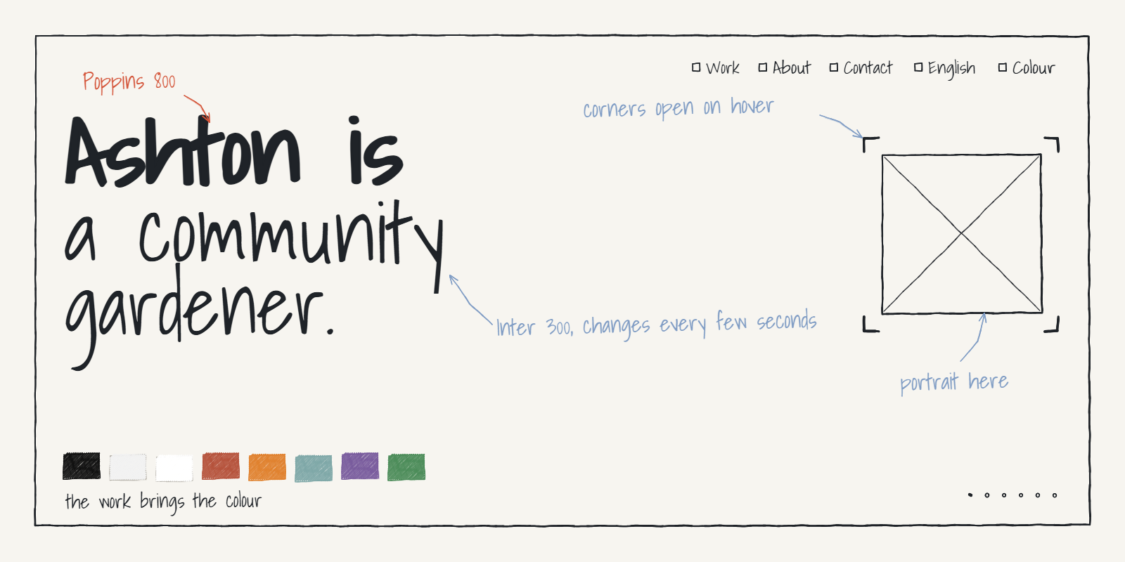
Ashton is a community gardener.

1Steering clear of the pervasive AI look
Since AI came along, there really are a lot more designs, websites, videos, and so on out there. I'll admit that people's personal websites these days are impressively polished and show plenty of good taste. Take, for example, how after this Opus update the whole internet was flooded with "Apple-style ad videos" — and there's no denying they're better than what most video creators with five years in the industry used to produce.
But when everyone mindlessly comments "so well designed," I do feel a bit conflicted. I don't believe people genuinely can't tell how strong the AI flavour is — it's just that in some cases you can clearly see the creator was trying to polish things up.
There's a rather tricky point here, which I'll explore through some background involving our community first. If that doesn't interest you, feel free to skip straight to the next section, "Why build a personal website, and what to make it like."
The community's second-generation website and logo
The website production and the choice of the new logo for Superlinear are, of course, now entirely handled by the class rep themselves. Setting the website aside for now, let me mainly talk about what things were like when I was brought in to do the logo redesign.
First of all, thanks to Karry Huang. The community's first logo was made by Karry. Long-time friends have all seen it, but friends new to the community may not know about it. The story is in the post The Logo Design Process, Part 1: Drafts from Five Designers (title translated), and I've put the images below.
I built my version on top of that design. Back then I produced a full set of guidelines, and the deliverable itself was fine.
The problem was that I was still thinking like a student: I wanted the whole package to look polished, and I approached it purely from the perspective of "this will eventually be handed off to a print shop or another designer," completely failing to consider that small teams generally don't have these issues — which effectively meant I never put the class rep's needs first. So the handoff process back then wasn't great. What I delivered at the time, setting quality aside, was at least pretty terrible in terms of efficiency.
That said, speaking as a graphic designer, as the person who actually did the work, I'd still like to say a few words in my own defence (an abrupt attempt to prove my own value).
The version I designed back then had two variants: The small icon/favicon was simplified further, and it's already basically the shape of our current logo. To be specific, in my original design the main logo had eight triangles and the favicon had six; the default colours were initially light yellow and sea blue, carried over from the previous design.
Honestly, what I had in mind at the time was exactly this simplest six-triangle version — I just worried that simplifying so much in one go wouldn't bring out the effect. This August, our community officially switched to the current green six-stripe version.
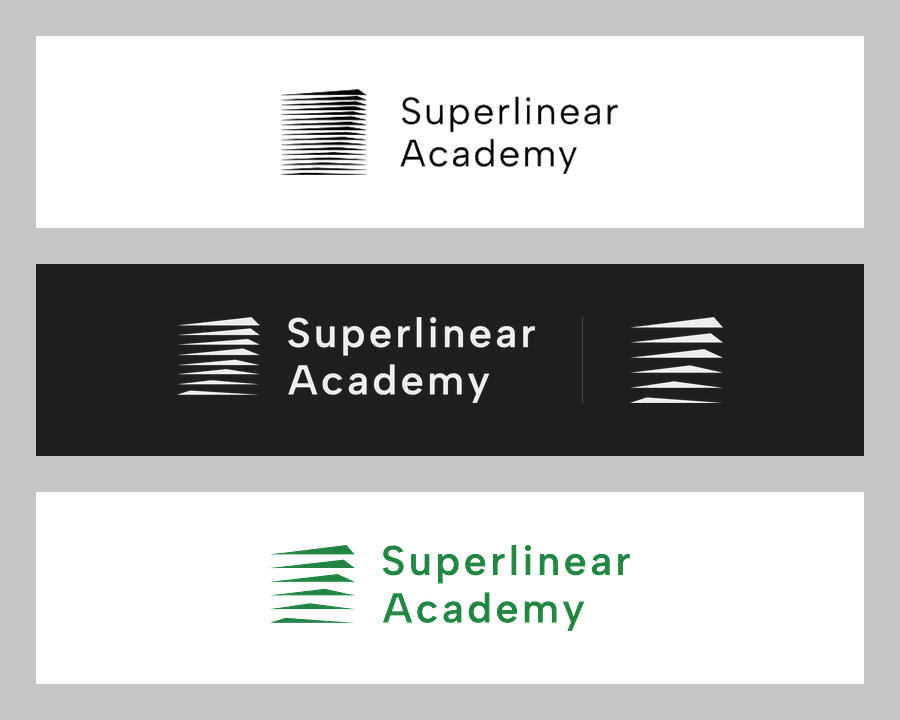
I won't go into the details of this version's design here. I've also shamelessly put it on my personal homepage, as a project showcase. Of course, this was also agreed upon with the class rep in advance — thanks for his permission.
2Why build a personal website, and what to make it like
A designer-based portfolio website
Why emphasize designer-based? There are actually all kinds of personal website styles out there now, but most of them are mainly programmer-style program demos, blogs, or photo journals. Websites with a distinctly designer feel at a glance — the kind you see on IKEA's or Apple's official site — used to be the sort of front-door dressing done only by fairly well-known design studios or deep-pocketed merchants.
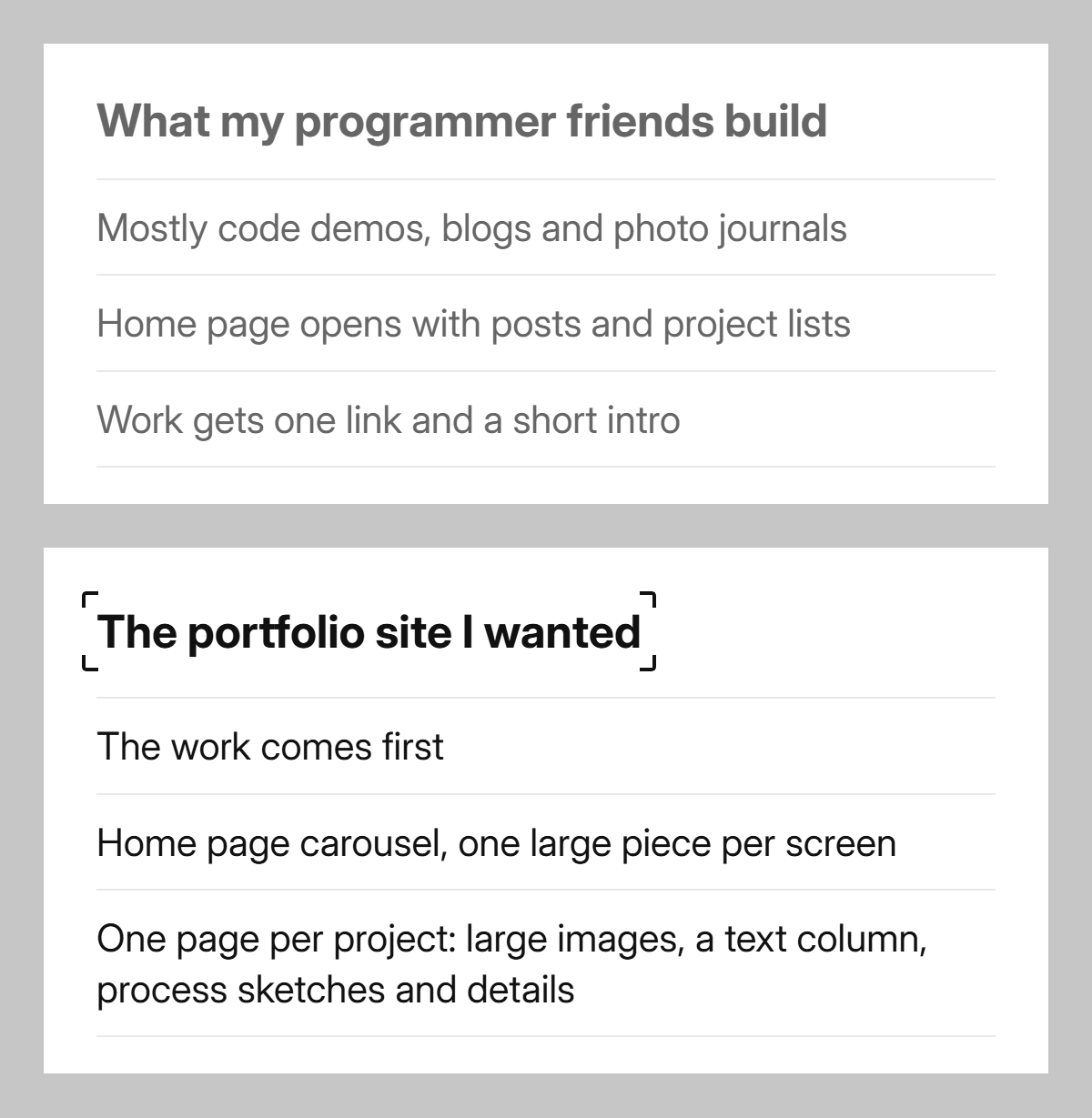
And in the past, most people who did design didn't understand programming either.
Let me jump straight to a blunt conclusion: Designers who want a good-looking portfolio site, personal site, or studio site usually lack front-end coding skills—their ability or time just doesn't allow it. Programmers, on the other hand, typically feel it's not worth the extra effort.
I belong to the former group. But now, I can build a version I'd give my own approval to, all by myself, in just two days.
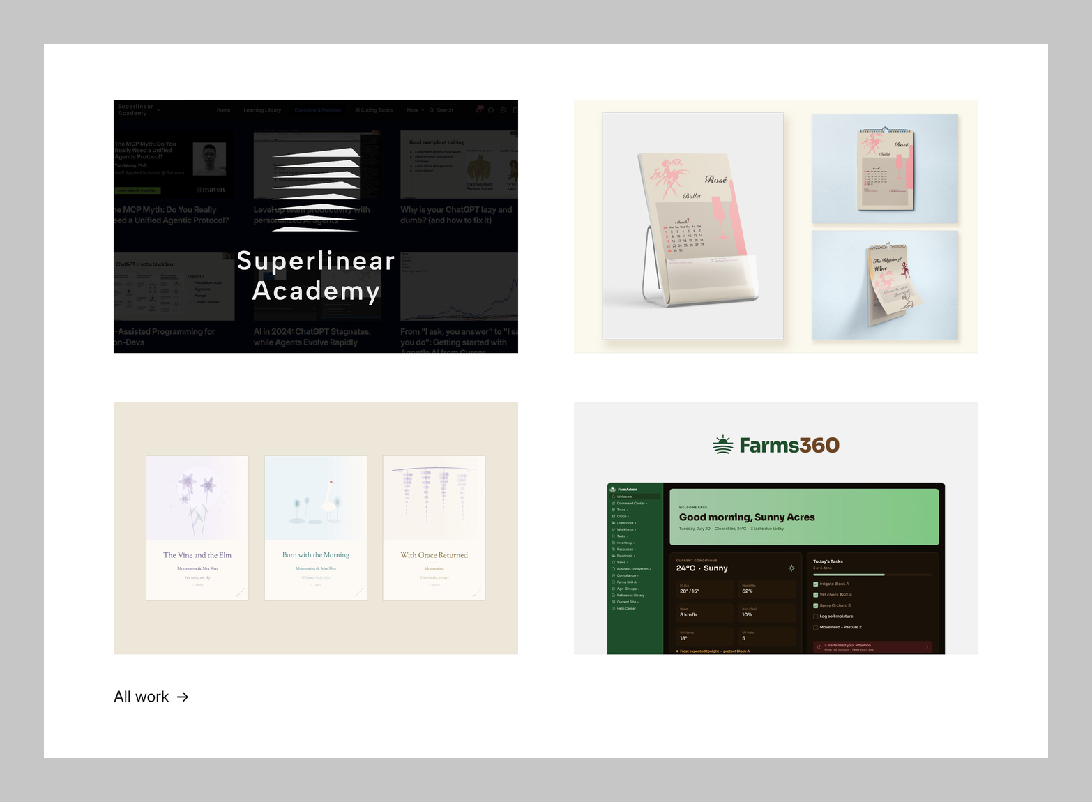
I have to make a self-deprecating remark here: After all, I'm not formally trained in design.
Starting today, the most presentable piece in my portfolio—the pinnacle of my design work so far—may well be this website itself 😂. Of the works it showcases, I doubt any is more polished than the site itself.
It's kind of a 'keeping the casket and returning the pearl' situation—though I'm not even sure I'm using that idiom correctly.
Who the website is for, and the corresponding language
The main site is entirely in English, since the target audience consists of local North American designers, recruiters, and clients.
If reading English isn't convenient for you, there's also a Simplified Chinese version here: world.ashton.is/zh-hans.
Currently world.ashton.is only the Simplified Chinese and English versions are public under this domain; the other language versions are a lower priority, and they may all end up hosted here in the future.
Skeleton and asset library
I'd also like to share who I drew on for this design.
First, the simple conclusion: The current core skeleton is modelled on a Japanese design studio, Daikoku Design Institute.
I have a habit of constantly building up asset libraries on Pinterest and design websites, full of templates and references I personally like. This past July I even did a dedicated round of curation: I first shortlisted 50 websites — personal portfolios, studios, museums, and typography sites — then went through them one by one, scoring and ranking them, and finally broke down three of them. Daikoku was the primary template I settled on at that time.
On top of the Daikoku skeleton, I also blended in elements from other parts of my asset library — including the animations later on, which also come from that library.
3Hierarchy and Motion
Hierarchy: Levels
Since this is a designer-oriented site, I already had an expected result in mind for how the whole hierarchy would be laid out and how the motion would flow, so I told the AI which effects absolutely had to be achieved.
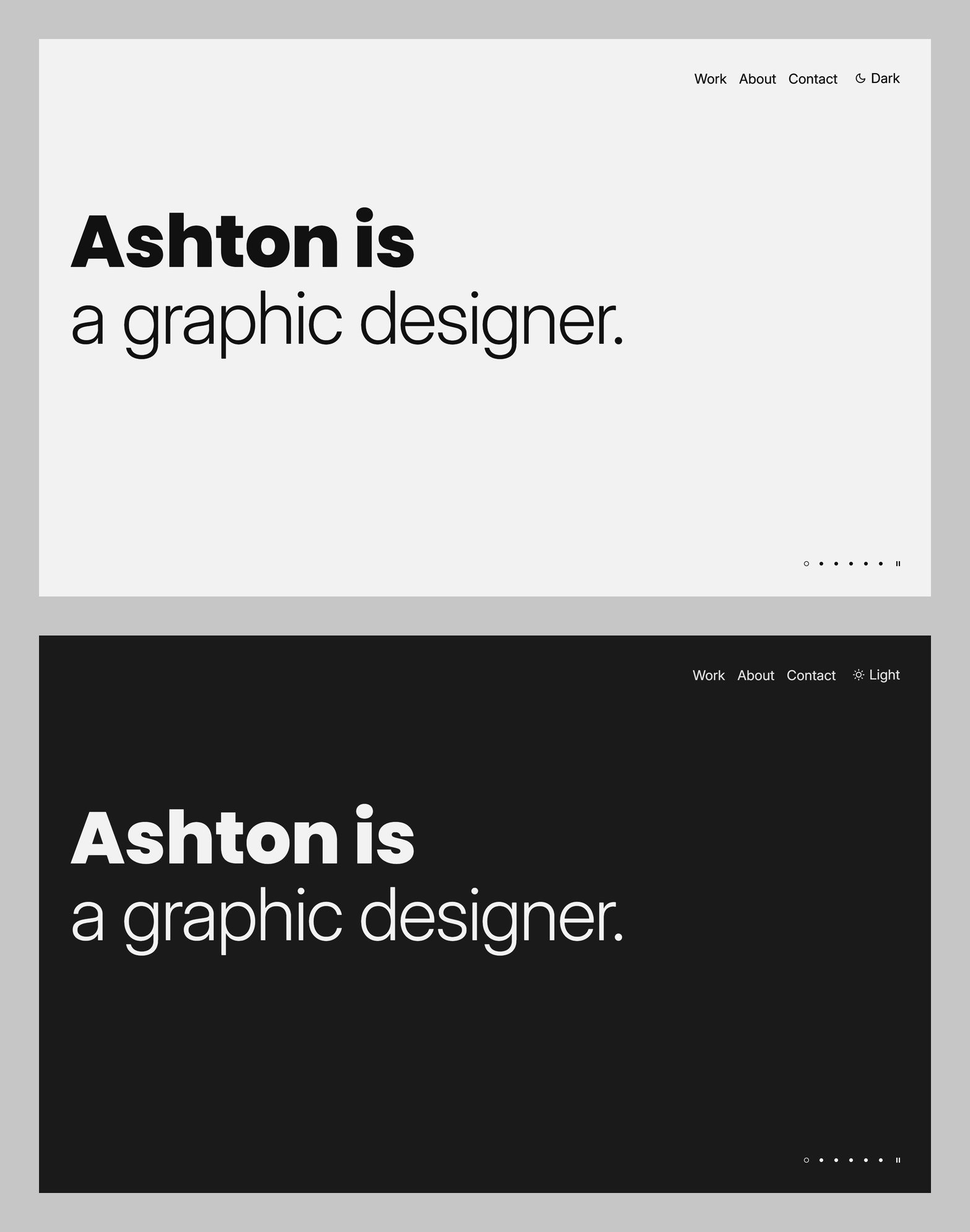
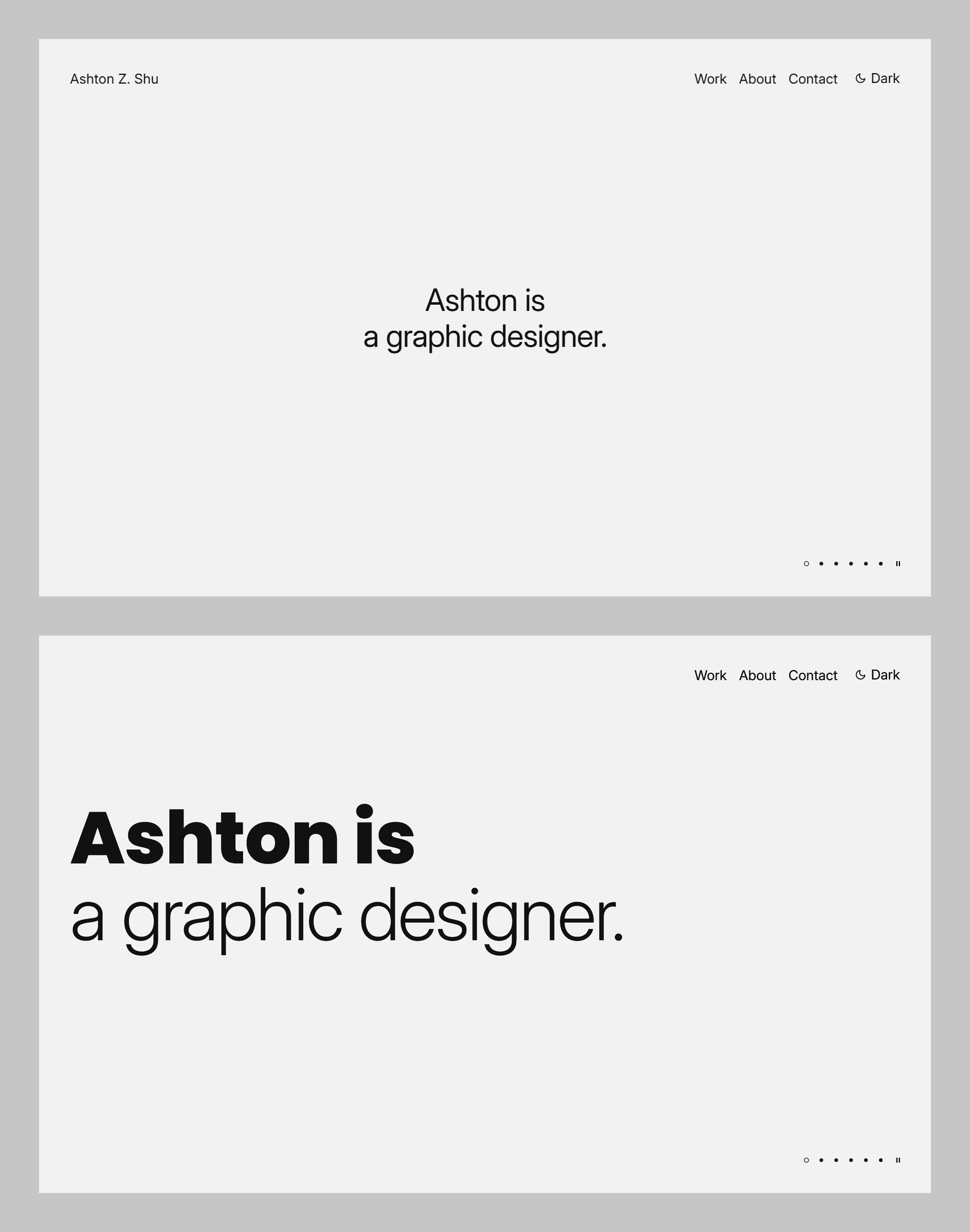
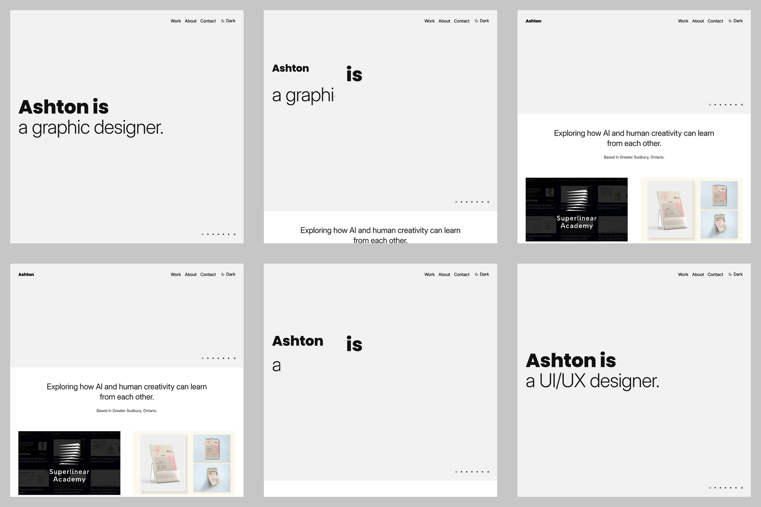
The core of the homepage is that half sentence, "Ashton is...". I chose the very bold Poppins 800 as the typeface, and the very light Inter 300 for the identity that follows—first pulling the font weights apart.
For the subsequent animations I started from the identity. It's split into two levels, distinguished by different motion: The primary identity is a drop-in fade (drop-in — drifting down a little from above while fading in); the secondary identity under the same identity is a horizontal wipe (wipe — a mask reveals from left to right, then collapses back from right to left). This way you can tell at a glance which ones are my main career and which grew out of it.
Ashton is
a graphic designer.
↑ primary identity: drop-in fade
an illustrator.
↑ secondary identity: horizontal wipe
a photographer.
a UI/UX designer.
a concept artist.
a digital painter.
a character designer.
a community gardener.
an AI architect.
a human storyteller in the loop.
an AI evangelist.
Ashton was
an electrical engineer.
↑ “is” becomes “was” and turns grey
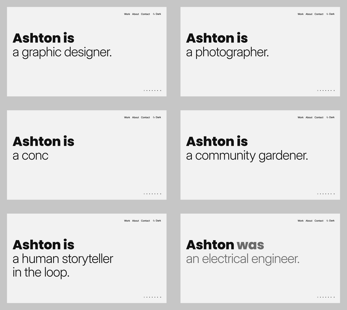
And I also hid a little Easter egg: On the last line of identities, I put a past identity, an electrical engineer.
As always, a quick self-intro for folks new to the community — my old, outdated self-introduction was titled Mts | Greater Toronto | Back in North America after years of work | Now a graphic designer | Former electrical engineer | Sommelier | Exploring side work and a nomad life | Always trying new fields | Life hacker | INFP or ENFJ, undecided (title translated).
*A quick disclaimer about my location, to head off any nitpicking:
I'm really not latching onto Toronto with no actual connection — the place I live is just so small that unless you're a local, even if I told you the city name, you still wouldn't know where I am 🫠
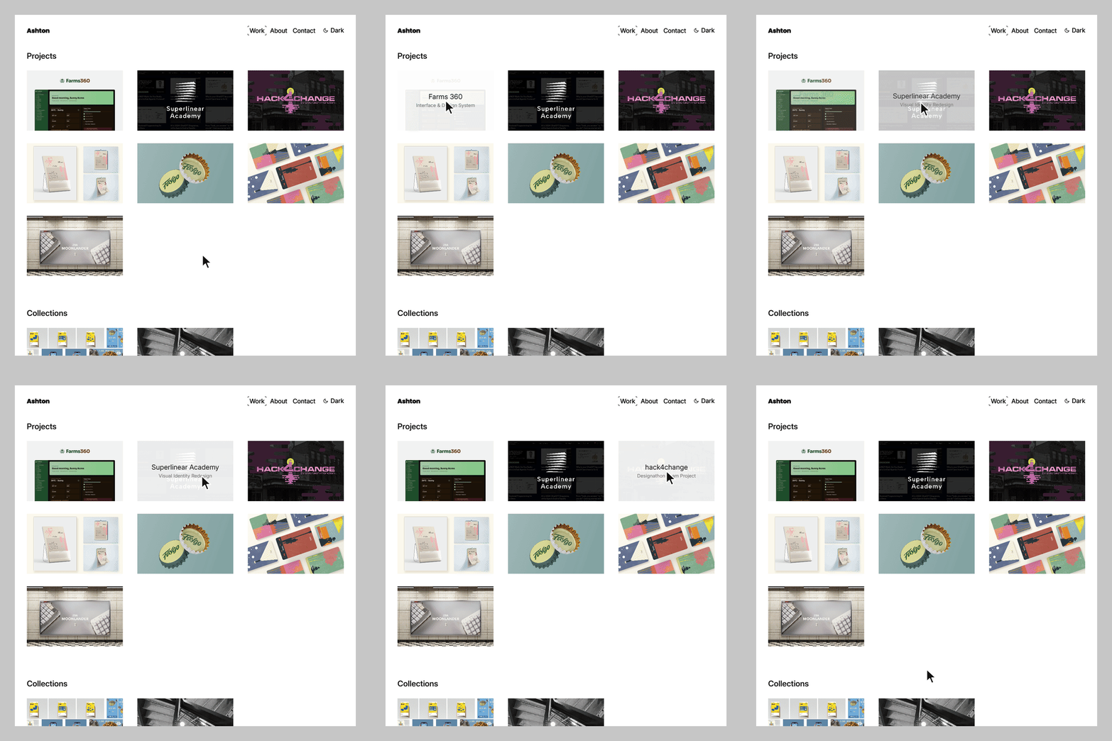
OK, moving on. The portfolio is organized into categories too — Work is split into three groups: Projects, Collections, and Personal.
Hero Section animations
In this first major version, what I put the most thought into was the Hero Section animation — simply put, that's the first thing you see when you land on the homepage, the part where the hero image is displayed.
The part where the name expands and then folds back follows the same approach as one of the title sequences in my asset library. I'm using it that way for now and may still change it later.
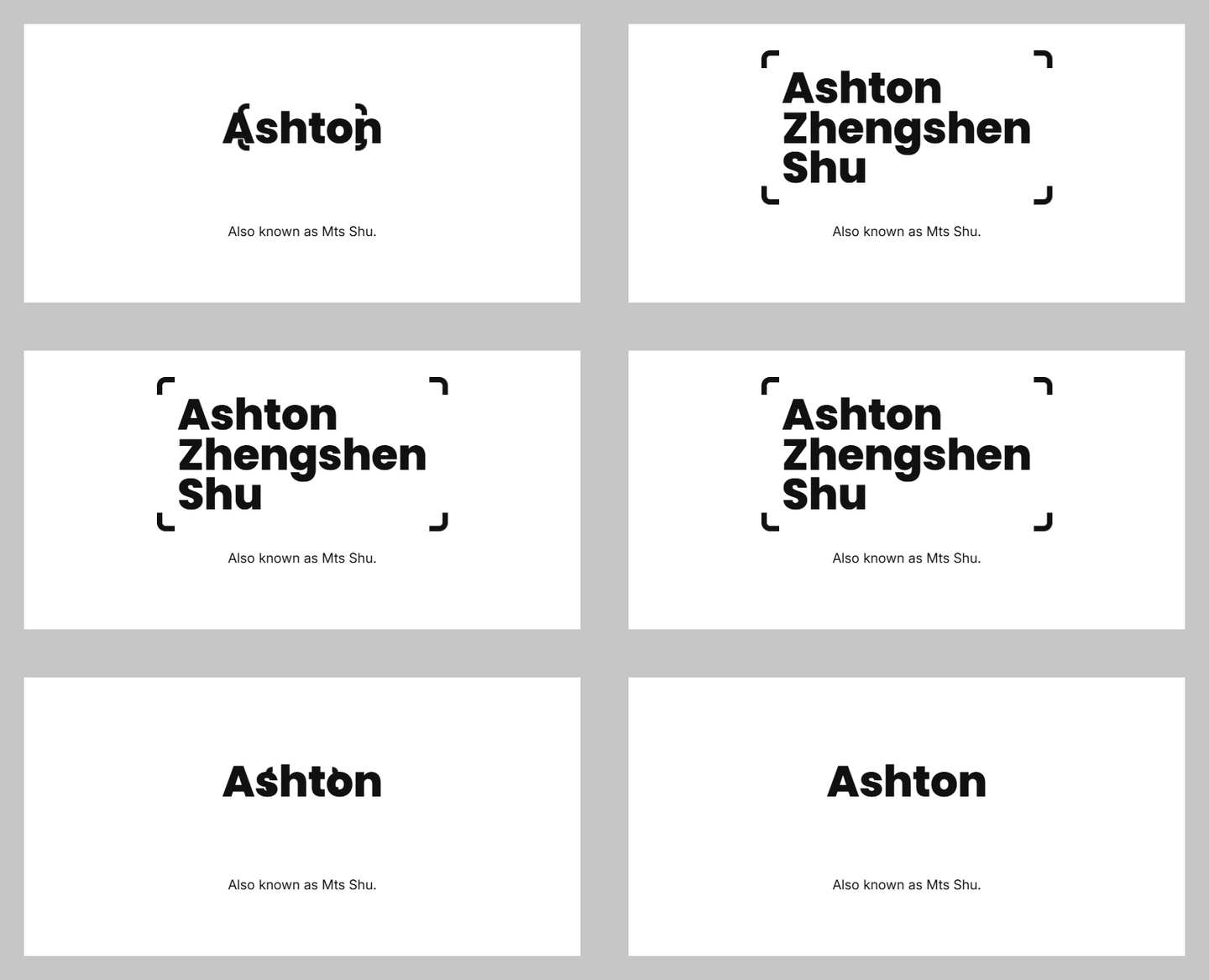
Why was I so keen on the four-corner frame? Because when I record my screen or take screenshots on my phone, the icons that appear in the notification bar have exactly that kind of four-corner frame . I carried this element through the rest of the site too, so there's inheritance and linkage between them (a motif, as it's usually called in design).
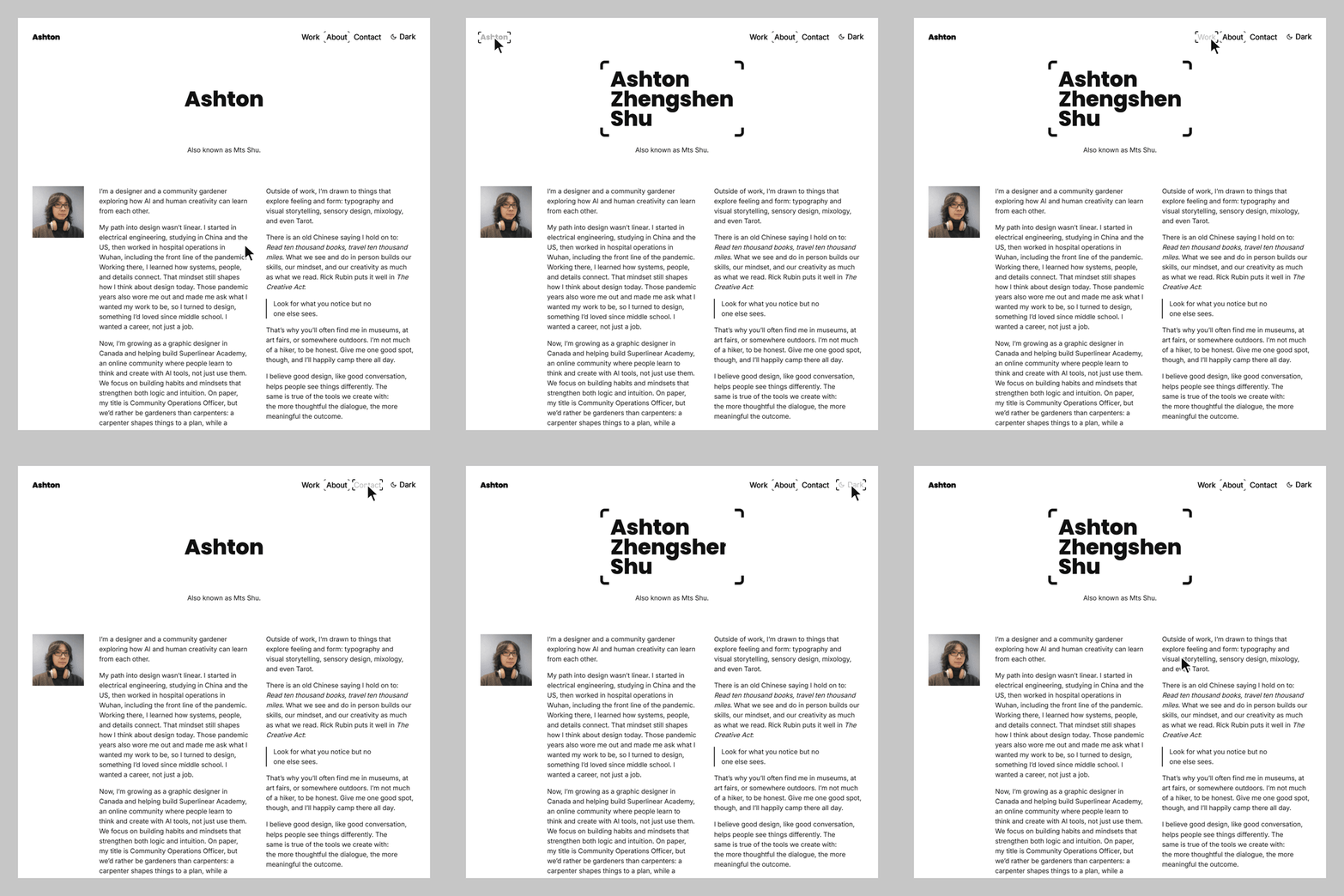
After the entrance sequence, I iterated through several more versions to tie these elements together more organically, guide the viewer's eye, and make the whole thing feel more like fluid cinematography. From the original opening until now there have been three major versions: In the Alpha version, 12 identities appeared one after another.
For the V1.0 iteration, this is how I described it at the time (it was voice input back then; I've tidied it up a bit here):
So after the whole entrance animation finishes, the Ashton text as a whole just... smoothly moves to the top-left corner — the top-left corner should be the module set in exactly the same typeface. That way the whole animation has a clear origin and lineage... and the visuals stay coherent. Plus, the same word won't keep reappearing in one spot.
In other words, once the cover animation finishes playing, the way "Ashton" comes to rest is exactly the site's wordmark.
V1.1 took it one step further: The "Ashton" from the cover first lands in the "Ashton is" line on the homepage; when you scroll down, or the carousel switches to a portfolio image, it shrinks into the top-left corner and becomes the wordmark.
4Version iteration notes
Based on the records on my computer, here's an itemized log of the process:
Evening of the 15th: I got started a little after 6, put together the skeleton, and built the homepage.
The 16th: I added the works page, created a name animation, and finalized V1.0 at 4:30 PM; in the evening I spent two hours saving screenshots and screen recordings of the entire site.
The 17th: I iterated to V1.1 and put it online a little after 4 PM. I started writing this post at noon and kept revising it until just before publishing.
In total: Up through V1.1, judging by the commit history, I actually worked over 18 hours, with 134 commits in total;
writing this post took more than 12 hours end to end, with most of the time going into revisions in the latter half — in the evening I dictated a voice recording for over 40 minutes, then spent more than two hours myself proofreading and revising it sentence by sentence, and the accompanying images went through six rounds.
Plans: The next version is already in the works — for example, a dropdown menu has been added to the Work button.
Admin Dashboard
Because pages, drafts, and unmerged changes kept piling up during the build, after V1.0 I had the AI set up an admin dashboard as well, where everything that changed in each version gets recorded.
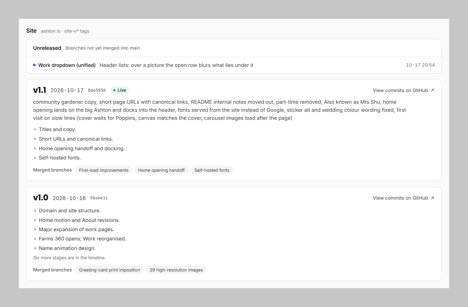
Going forward, I also hope to organize and integrate things like my newsletter, shop, and articles into the site and this dashboard — which is also why I plan to keep improving it.
5The Conception and Preparation from Half a Year Ago
Quite a few writers have said that when asked exactly when they started creating a newly finished work, it's hard to give a precise answer, because so much of the relevant experience and scattered ideas has been quietly building up long before it shows.
Take my website design this time: It was two days from when I officially got started, but counting from the conception and ideas, it's certainly far more than that. The 10-plus or 20-odd hours I mentioned earlier naturally represent even more than that too. Never mind the website ideas and design-effect notions I've had since I first learned Flash and Fireworks in middle school — even just the asset library experiments I mentioned earlier for this build began half a year ago.
Back then, in order to help the class rep and Ya-ge (Yan Wang, co-founder of Superlinear Academy) sell the course and answer classmates' questions, I took the course myself too (though I never did the homework afterwards — mea culpa). But chatting with them day to day, I got plenty of direct guidance; and it was also under the class rep's urging that I took the first step to using AI well early on: I stopped using the chat window.
At the time, I also had AI help me build a personal website, running in parallel with the research and the selection of the material library. But two things got in the way: First, AI wasn't capable enough back then, and second, I was slow at doing things with my own hands. The result looked AI-made at a glance, and no matter how I tweaked it, it never got better — plus it burned through that week's tokens in one go.
That version took from late June to mid-July, a little over two weeks in total: three versions of the homepage, roughly one per week, while researching the reference sites took just one afternoon. I wasn't satisfied with the final result myself, so it never went live.
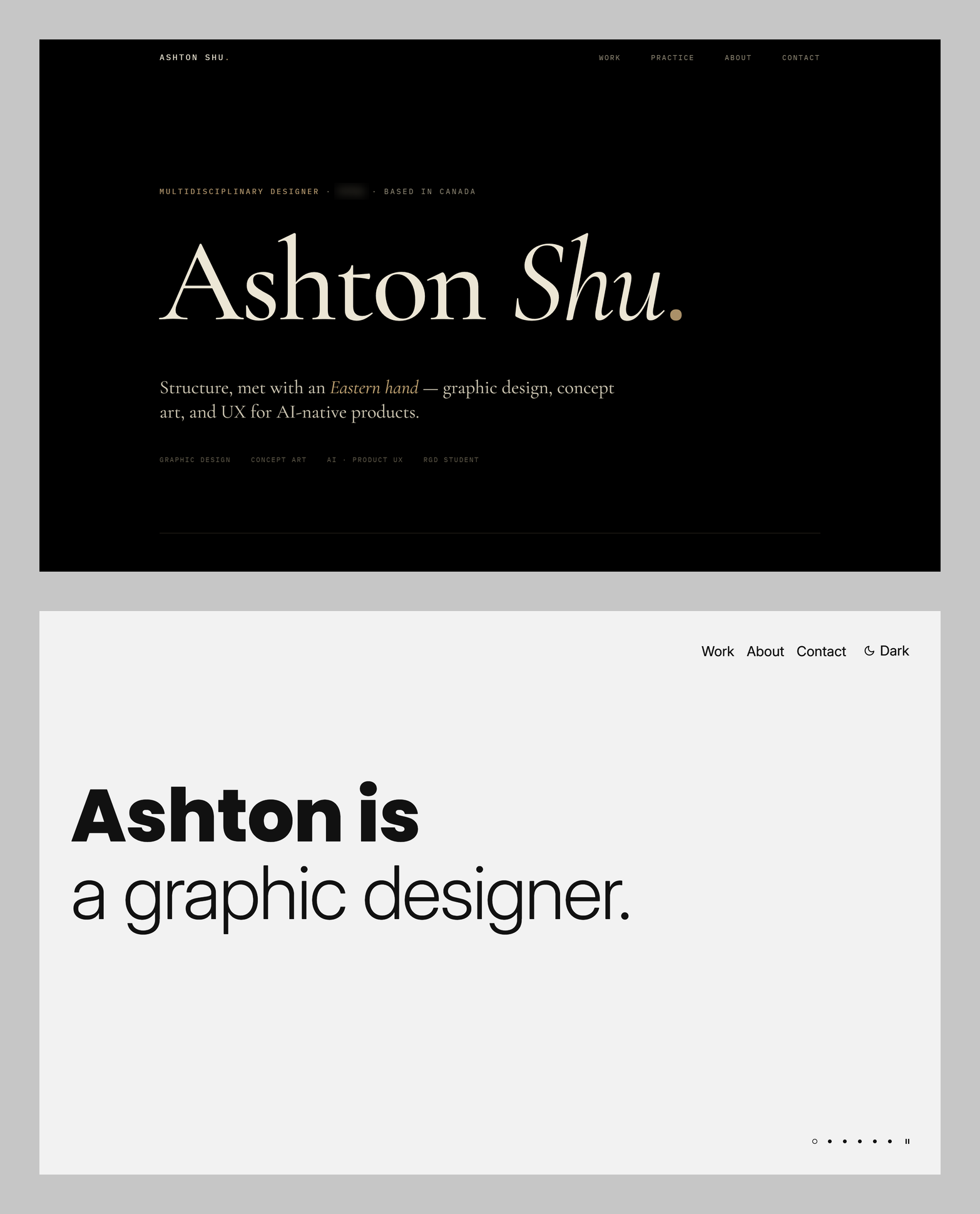
The main template used back then was also Daikoku. Let me put together a comparison image for you to look at — you can actually see that even with the same main template, the same template, and identical HTML, as soon as the CSS is different and the choice of other materials is different, the final result is worlds apart.
I'd like to ask you all for your help
Finally, there are a few things I'd like you all to help me take a look at:
Are there any typos anywhere, or any wording that isn't particularly good?
When you refresh the page or re-enter the site, is there anywhere where the display looks disjointed, doesn't render smoothly, or shows something incorrectly? The homepage cover is shown only once within the same tab — opening a new tab will show it again — so you can try both cases.
Are there any other places where the AI feel makes them clearly inconsistent with the overall style, or noticeably less polished? I'm asking this not to deny that I used AI, but to find the spots where the polish didn't keep up.
And finally, a little self-promotion
Besides reaching out to me privately for community questions, if anyone has web or graphic design commissions and thinks my current work is pretty good, and would be willing to offer me some side-project opportunities, you're also welcome to reach out to me through the Contact page on my website. And by the way, you could also help me test the domain email I just set up.
Posting the website link one more time: Ashton.is